Design
Last year as editor-in-chief marked my transition from a base-level section editor to one who oversees and creates design for the whole newspaper, and this year, with the absence of print issues, I have redesigned our website to make it look far more professional and easy to navigate for our readers.
Header Changes: Print
Old Print Header (2017/18)

Old Print Header (2018/19)

Newest Print Header (2019/2020)

My old editor-and-chief and I worked to re-design the header of our print issue in honor of our issue's 50th year anniversary last year. After tinkering with the design, we settled on a visual that represents our anniversary as well as our social media and website in order to promote our online content. It's a bit cluttered, but this year's design, should we be able to publish any print issues, would be a simplified version with just the social media icons as it will obviously not be our 50th anniversary anymore.
Header Changes: Online
Old Online Header (2018/19)

Old Online Header (2019/20)

New Online Header (2020/21)

I pride myself on the work I have done for our website. I felt that the black theme of the website did not match our school colors, which I feel is how we are best recognized and remembered. I, along with our photography editors Nolen Stevens and Andy Thompson, settled on the new shade of purple. This year, I made significant changes to the menu portion of the header, adding many different subsections beneath each of the six parent sections that normally appear in our print issues, as well as adding several other parent sections for just the website. I have also made significant changes to the rest of the website's design, which is highlighted further in the "web content" section.
Page Design
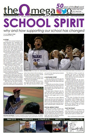
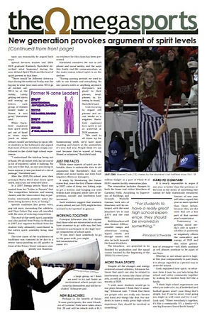
Last year, I designed the front page of our monthly print issues. For the 2019/2020 November and December issue, my story ran on the front and back pages, so I figured I'd design both pages as well. I quickly realized that there had to be sub-heads or the readers would quickly get lost. I also chose a few action shots that I thought represented the emotions of the student section well. Also, for the back page, I experimented with a self-made infographic and cut-out.
Font Change
Old Font (Corbel)

New Font (Century Gothic)

Based on inspiration from the DC convention last year, my old co-editor-in-chief and I felt it was time to make a change for fonts. Our previous font for everything except story body text was Corbel, but we swapped it for the more professional Century Gothic font in between the October and November/December issues. Journalism is about professionalism and concision, which is exactly what we were aiming for here by replacing the soft, flowing, humanist sans-serif curves of Corbel with the sharp, rigid and concise sans-serif Century Gothic font.